For many of us, spaces that rely on just a few hues—and especially strictly black-and-white rooms—feel too austere. Then we saw the work of Boston-area designer Mollie Johnson and got inspired to go on a color diet. Her interiors lean toward a pared-down palette, yet each one looks so inviting, you want to settle in for a week. As Mollie says, “When you have one or two colors, it’s just much easier on the eye. It’s quieter than a bunch of shades, but can be more elegant and beautiful.”
Tour one of her projects—a Spring Lake, NJ, home awash in easy-on-the-eye hues—and read on for her expert advice on how to make monochromatic rooms work for you.
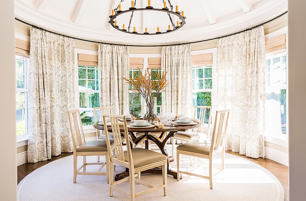
Painted wood furnishings—like these Swedish-style dining chairs—break up the heaviness of lots of exposed wood.
Tip No. 1: Beige Is Beautiful
To find the right color for a room, take a cue from the space itself. This breakfast room has a wraparound view of the outdoors, and as Mollie explains, “your eye naturally wants to look outside, so I didn’t want to inject strong color into the room.” First she chose the linen drapery, in a sandy beige damask, to set off the views, and then she carried that color throughout the rest of the furnishings. “The simplicity of this color keeps the focus on the people you’re eating with, the outdoors,” she says. “You don’t feel that you’re in this ‘decorated’ room.”
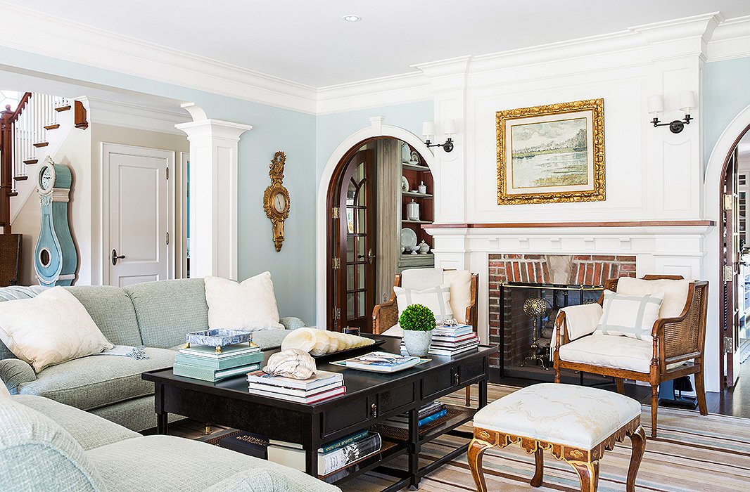
A clock standing in the entrance introduces the blue palette right off the bat.
Tip No. 2: You Don’t Need Crazy Prints to Look Lively
The living room, with a palette that picks up on the soft ocean blues of the nearby beach, has a relaxing, quiet ease. For Mollie, it’s a matter of personal philosophy and taste: “I love rooms to be beautiful but more on the quiet side,” she says. “I don’t like loud prints, I don’t like that accosting feeling of big color.” The closest she came to pattern is the striped Tibetan rug, which “has the look of a striped beach towel.”
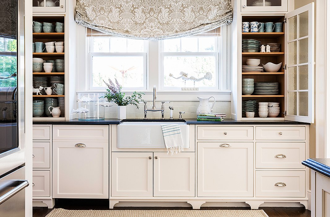
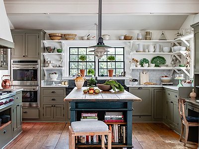
Against the cream color, the kitchen’s textures really pop: the glossy countertops, the soft linen drapery, the fibrous rug.
Tip No. 3: Create Simple Harmonies
With a minimalistic color foundation, making rooms relate to one another is a cinch. “There should be a harmony between the social spaces of the home—the dining room, kitchen, and living room,” says Mollie. “They don’t have to be the same color, but you should get a subconscious feeling of continuity.” The ocean tones of the living room show up again in subtle ways throughout the kitchen—note the china, for instance, and the kitchen towels. And the theme is carried through with the beige damask that dresses the dining room windows.
A pair of glass lamps give a light, airy feeling—without a drop of color.
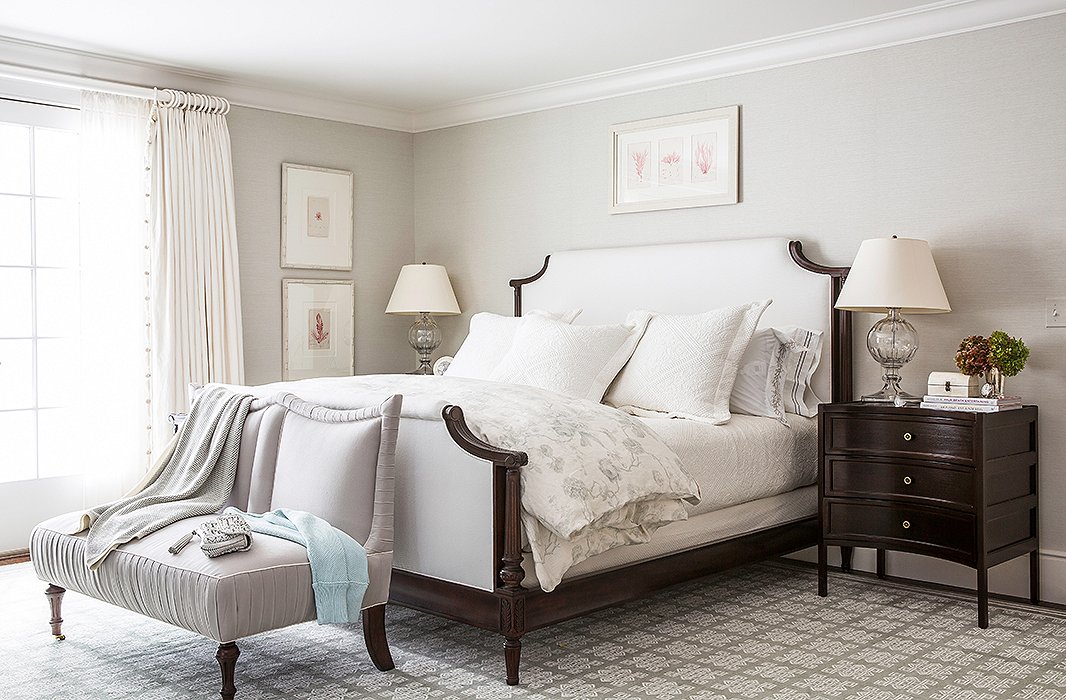
Tip No. 4: Let the Furniture Speak for Itself
“Don’t try too hard to make a big splash,” Mollie advises. “If you put your money into furniture and good fabrics, you’ll get an elegant, textural feel.” In the master bedroom, she chose heavy linen drapes, a linen-upholstered headboard and footboard, and cotton bedding. The gray-silver fabric on the bench allows you to really grasp the feminine look of the gathered edges.
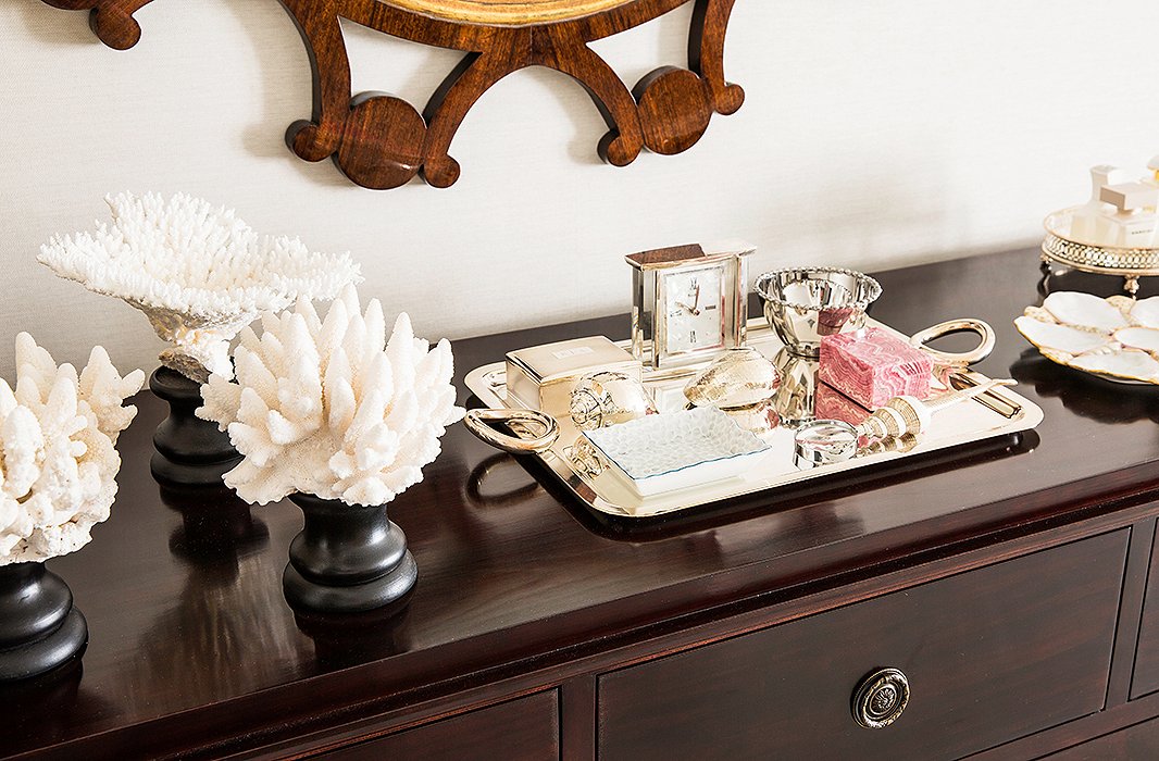
In the master bedroom, a raspberry-colored stone subtly echoes the raspberry tones in the artwork.
Tip No. 5: Wood Gives Depth to Any Color
Anyone who thinks a stripped-down palette might lack zip should study the dresser in this master bedroom, where an assemblage of creams and silvers on dark wood takes on a great, shining energy—all while staying elegant. “Wood is often all the contrast you need,” Mollie explains.
Meanwhile, the few notes of raspberry in this room—in the artwork and the stone on this dresser—nicely complement the cool silver. The raspberry-and-silver combination is a favorite of Mollie’s; she says apricot and silver also make a lovely pair.
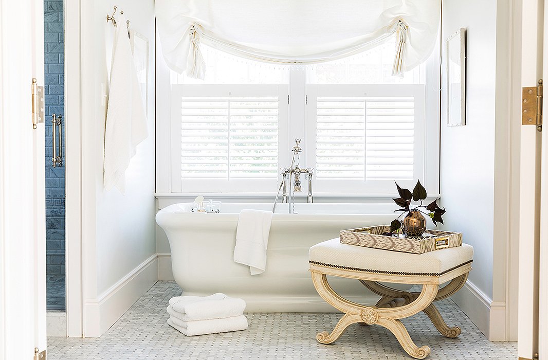
An antique bench brings a second neutral shade—a soft cream—to the bathtub zone.
Tip No. 6: Don’t Mess with the All-White Bathroom
Of course, a patterned bathroom can be fun, but there’s nothing like white to make this space feel like a true retreat from the rest of a home’s activity. “White just creates that spalike effect. It’s about a feeling of simplicity. The lighter and crisper, the better,” says Mollie. And given the washability of a bathroom, this is one room where you can really preserve a white glow easily.
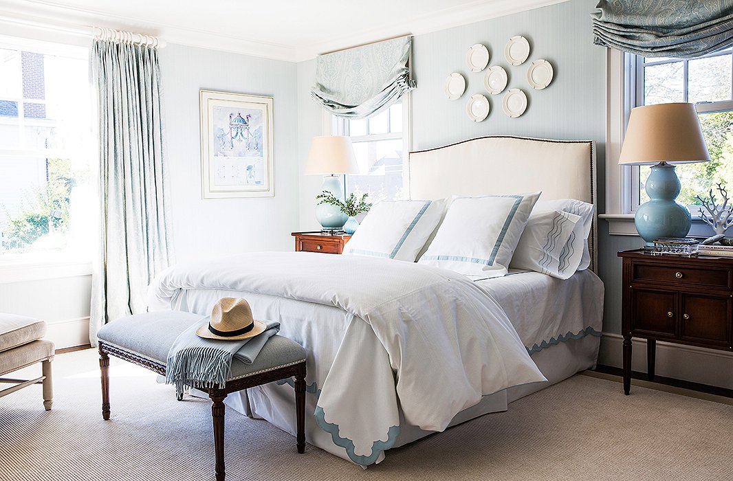
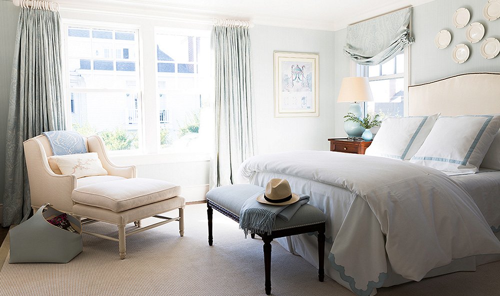
Blues and creams make for an easy-to-master mix.
Tip No. 7: Build Layers of the Same Color
At first glance, the guest room seems to have a strict two-tone palette of cream and light blue. Then you realize none of the creams or blues are exactly the same. The takeaway: Instead of driving yourself mad trying to perfectly match the pillows and the lamp, let the tones create a lightly layered effect. Do this especially if you start to worry that a space is lacking something by not having using more color or a few patterns. In Mollie’s view, the adage “less is more” truly applies—rooms can be enriched by texture, by their views, and by their contrasts just as much as (if not more than) by those patterns we often rely on.
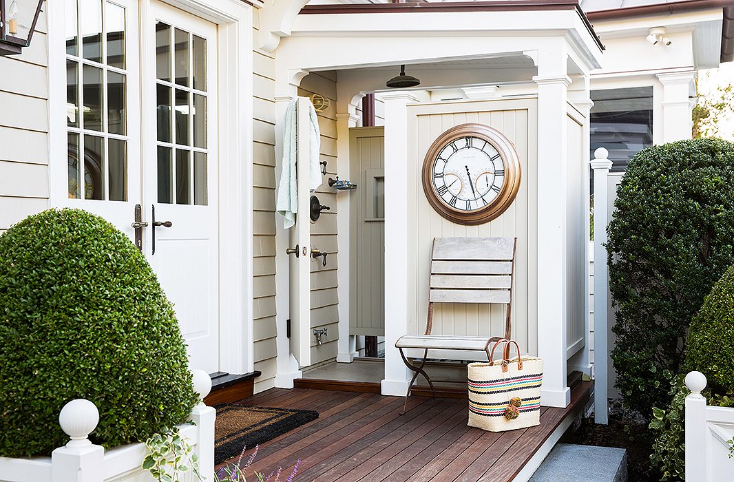
A painted outdoor shower area leads the eye from the home’s pool into the rest of the house.
Tip No. 8: Take It Outside
Rather than leaving all the wood of a porch area exposed, Mollie leans into the same neutral colors. By painting the outdoor shower area a warm cream, she set the area off from the rest of the landscape. Mollie says, “It’s so beautifully landscaped here, and the cream keeps the entrance understated. It lets the flowers be the focus.” Just as they should be.
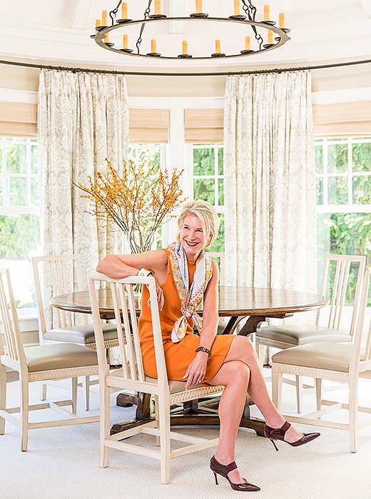
Mollie, basking in the beige of the dining room—and adding her own shot of orange.

Don’t try too hard to make a big splash. If you put your money into furniture and good fabrics, you’ll get a more elegant, textural feel.


To me, that lovely blue and cream bedroom was crying out for a little coral, a bit of chartreuse, some deep turquoise. I’m just that way.
Are the colors used listed somewhere?