His meteoric rise, thanks in large part to his fearless way with color, has made Patrick Mele a designer to watch. “I’m not afraid of color. I like bold statements with color. I like rich hues,” he proclaims. “I don’t tend to work a lot with muted or tertiary colors. I like crisp white, crisp black; I like crisp vibrant color as an overall statement.”
So how does he do it? We scored a peek at one of his design projects and asked him to decode his color choices, room by room, and the lessons started flowing in. Prepare to look at color in a whole new way.
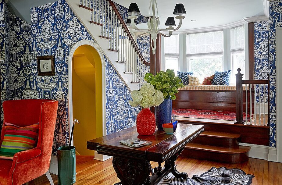
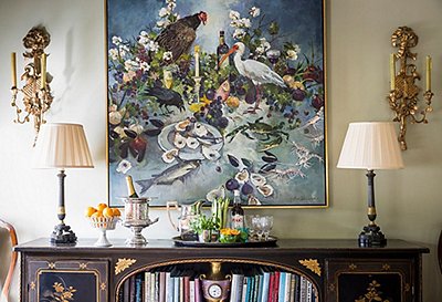
In the entryway, a bright and playful wallpaper by David Hicks gives a sense of lightness to the dark wood trestle table, a family heirloom, and the existing wood detailing.
Lesson No. 1
Think in Color Families
At first glance the home’s entryway looks like a riot of color, but after talking to Mele you realize he was actually working with a tight palette. “I wanted a lot of white, first of all, and then a mix of blue and orange,” he reveals. The secret? Working with various hues within each of these two complementary color families. His blues included “cobalt, turquoise, delft, navy. Within the orange family, corals, tangerines, grapefruits. Really rich hues, not muted.”
The homeowner loves blue, so that was the first color Mele decided to focus on when developing his decorating approach.
Lesson No. 2
Blue & White Always Works
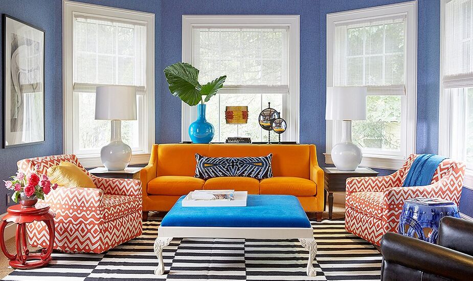
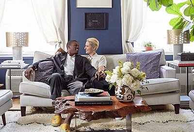
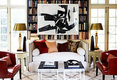
For Mele, using a combo of blue and white is like “wearing a white shirt with blue jeans, or a navy-blue blazer and a white shirt. It never goes out of style.” The classic color combination in interiors can be similarly dressed up or down. In the living room, Mele used a decidedly denimlike shade of blue grass cloth on the walls to add color and texture, which helps the silhouettes of the white accessories and the wingback chairs really pop. The overall effect is polished yet casual. “I think blue and white is the equivalent of black and white; it’s just not as fierce,” says the designer. “It’s more welcoming to most people.”

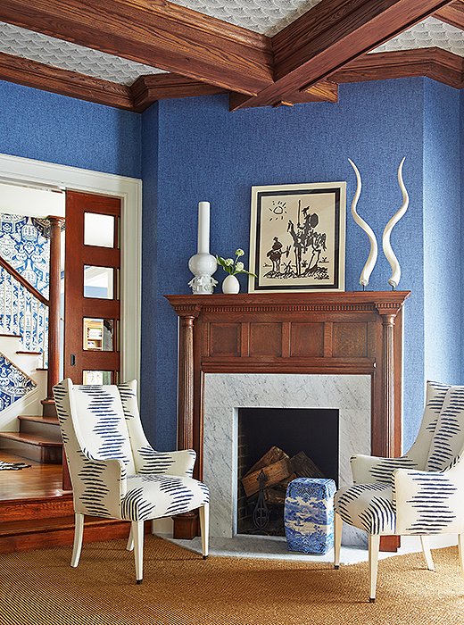
Black chairs by Hans Wegner tie back to the black base of the table Mele had made for the breakfast room.
Lesson No. 3
Pick a Palette, and Repeat
Working within a streamlined color palette not only helps the rooms themselves feel cohesive, but it also helps with the transitions between rooms. “When you’re in the middle of the foyer and you’re able to see all the other rooms throughout, you have the same family of colors repeated but in different ways in each space,” says Mele. Case in point: The walls of the breakfast room are coated with a similar blue to the family room, but this time with paint, and as in the entryway, a pop of orange upholstery has a striking yet grounding effect.
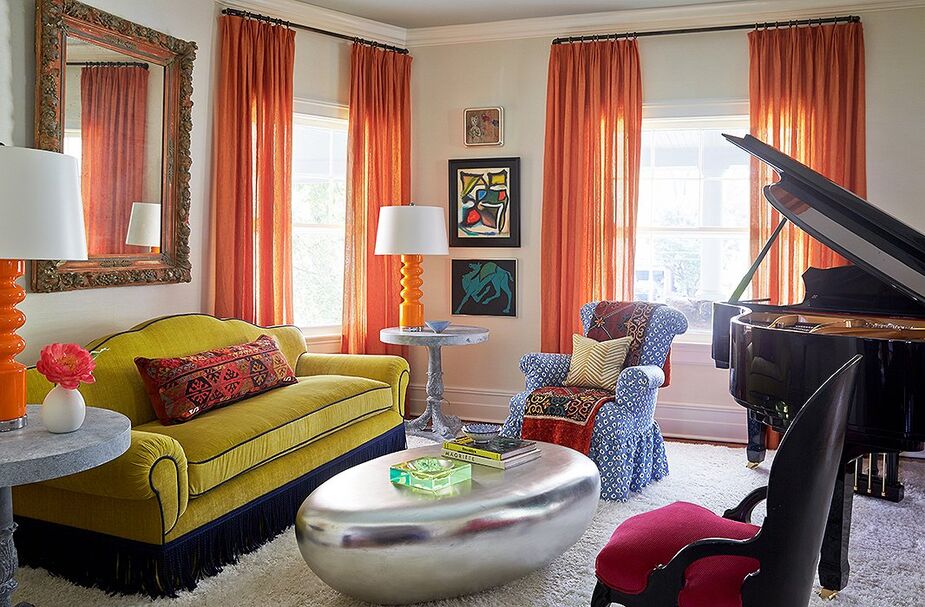
Mele added a decorative fringe to the sofa and a skirt to the armchair to reduce the number of visible legs in the room, given the dominance of the piano in the space.
Lesson No. 4
Play with Percentages
A genius way to get even more mileage out of a small group of colors is to do a flip-flop of sorts, pushing what was previously used as an accent color to the foreground. This is precisely what Mele did in this music room by using statement orange curtains and tangerine lamps while letting the blue and white recede to a single armchair. “It ties in blue to fit in with the rest of the house,” says Mele of his design.
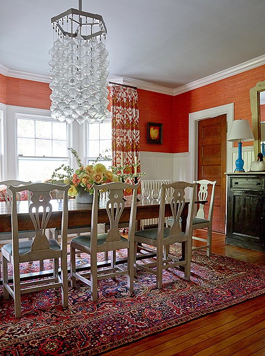
Mele covered two-thirds of the dining room walls with white wainscoting to temper the coral grass cloth that covers the reminder and painted the ceiling a subtle shade of blue.
Lesson No. 5
Use White to Freshen Things Up
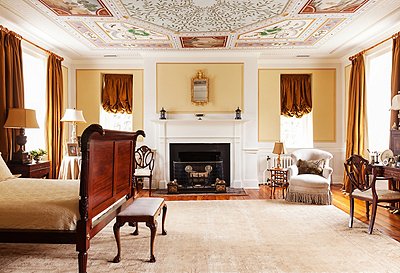
Mele is a huge proponent of painting things white, especially furniture. “I think white modernizes and freshens,” he says. “People are afraid of their old grandmother’s found furniture, but their forms are so fabulous and remain timeless. White just gives furniture a contemporary personality, I think. A fresh youthful spirit.” To strike the right color balance in the home’s formal dining room, Mele had the dining chairs bleached white from the original brown.
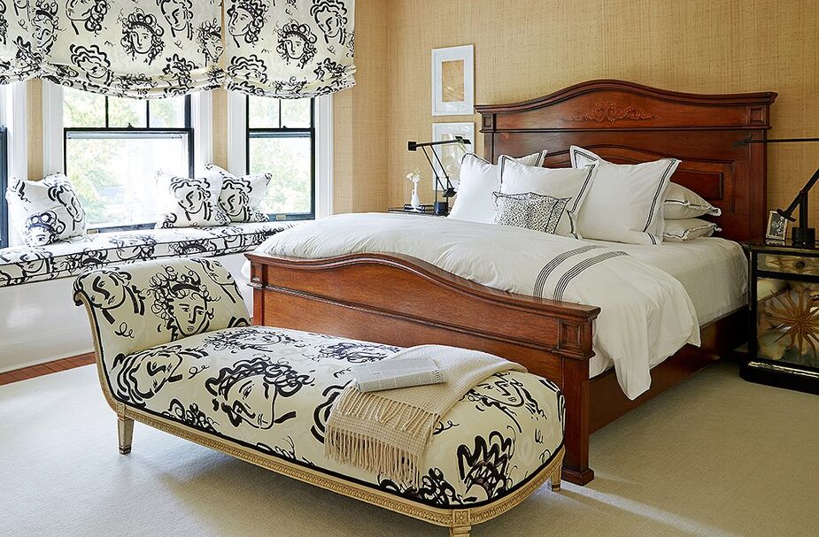
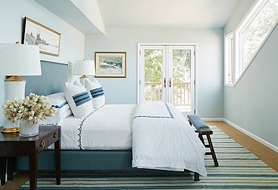
The fabric Mele and the homeowner fell in love with for the master bedroom is Jules et Jim by Clarence House.
Lesson No. 6
Strike a Color-and-Pattern Compromise
When dialing up the pattern, it’s sometimes best to dial down the color to achieve a calmer, less chaotic effect. When designing the home’s master bedroom, Mele started with a bold, Matisse-esque pattern and made his color choices, or lack thereof, from there. “I just wanted to use that pattern everywhere and not break it up with different colors or patterns,” he says. To that end he refrained from introducing any of the vibrant colors he used on the home’s ground floor. “I wanted it to feel a little calmer, quieter, even though it’s not a calm, quiet fabric.”
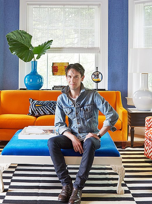
The color master himself, Patrick Mele, in the home’s colorful living room.
More Mele Color Tips!
What’s a great way to bring in brighter hues without it feeling overwhelming?
“If you aren’t comfortable using strong hues in a big way start small, with key accessories like textiles—pillows, throws, area rugs—that can be switched out as your mood changes.”
What are a few of your favorite decorating tricks for adding instant color to a room?
“Fresh flowers, books, lampshades.”
What are common color decorating mistakes you see?
“Dreary, gray, diluted versions of true color, I think, are overused. Too many institutional creams. Creams can at times be lovely, but more often than not they are sad and feel dirty and dated. Instead of cream, opt for true, crisp white. Instead of sand, try cocoa.”
Any specific rooms that are great for experimenting with color?
“Dining rooms are a great place to try out your first move in the color department. We usually gather in these spaces at night, a time when a deep color, such as claret or aubergine, illuminated by candlelight, draws you and your guests to the table. Powder rooms are another, which should be treated as little jewels and departures from the rest.”
Come decorate my house!
All beautiful rooms….Loved them…Gave me some ideas since I am moving…I really like the blue and white wallpaper. Very different looking…
When did blue and orange not go together? All these colors have been used together forever. Nice tips but not new.
Great if the “blues” don’t clash. Too many different shades of blue. Been there, done that.
Love his bold look.
Fainting couch at the end of the bed? It looks like the owner loved the piece, couldn’t give it up and they couldn’t find any other place to put it. Blue and orange? Seriously, is this a pep rally or a home? And there’s no way the piano wouldn’t dominate that room, even if all the legs of the chairs, sofas, tables were showing! This guy may be and up-and-comer but he’s still got a long, long, long way to go.
Blue and orange! This guy’s barely out of college and it shows!
Blue and Orange are complementary colours! Have you ever heard of the color wheel? They have been used together forever. And the recamier at the end of the bed? Who wouldn’t love that classic piece and then reupholstered in that bold contemporary pattern, genius!
I am with you! But reds and oranges are my hate colors so I am biased.
Have a glass of sangria and chill darling
are you familiar with color theory? because he’s doing it right. 🙂
I prefer the understated elegance of Thomas Pheasant or Barbara Barry, so It’s not my personal style, either, but it has a certain unique flair. It’s certainly not boring or dull or “usual”.
You always have to look at the lifestyle and personalities of the owners. Thank goodness we’re not all the same!
Why be such a hater? I love it. INDIVIDUAL style. Look it up.
Blues and oranges always work.. complementary colors! Love the b/w Picasso fabric! If u haven’t been to Barcelona to Picasso’s museum, u must go!
yuck
I have never liked blue with orange so I pass on this decor. I am more creams, blues and greens.
These are great tips! I’m getting ready to move into my first home and I’m totally saving this article when I start decorating!
xo Emily
http://www.fashioncolumntwins.com
I like it. But I can just image the “stagers” or realtors requiring these home owners to “get rid of all that color” before a prospective buyer tours….
Stagers and realtors can hang, in my opinion. I’m an interior designer, and just had my most adventuresome client–a transplanted Southerner with great, idiosyncratic style–sell the home we did together in 6 days, full price, and not one thing changed. The buyers were absolutely in love. I was elated. And really happy that vanilla did not win the day!
Love these rooms! The only thing I would change though is that raspberry color chair in the room with the piano. Maybe a color like burnt orange or red orange. That raspberry color distracted me and not in a good way. Everything else was awesome!
nice work…love it
I am planning on selling my home and the first thing both the realtor and every single painter I had come into my house tell me was to repaint the entire house beige. I can’t believe how many so called professional painters argued with me when I told them unequivocally NO! My house is all earth tones but consist of Milk Chocolate, mint or pistachio type of green, blues, different shades of browns or tans. There isn’t a single wall which is a crazy color but the entire house has been painted different colors. I absolutely love it and is the reason I purchased the home in the first place. The only color I added was two different shades of blues and browns in the bedrooms. I matched the walls to the existing colors when I have had to touch them up. I figure if it sells then any new owner can paint the home beige but as long as I own the home I’m not going to live in boring beige rooms. I love color in the home. It brightens up your mood or calms you depending on what color you use.
Home sellers will sell their home faster and usually receive higher offers if the seller’s “personality” isn’t showing throughout the entire home . That is why a realtor will suggest neutral wall color and no personal items (photos of family) on walls or tables. I love color too, but when purchasing a home I want neutral colors so I can evension my own decor and color in the home.
I figure I’m going to repaint everything anyway so I never care what colors are on the walls or what the owner’s personality is or how they show it. Buyers should look at the bones, the sizes and layout of the rooms, etc. The rest is nonsense. People have been watching too many HGTV shows.
Paint it whatever colors you want but I disagree with you about “the rest is nonsense”. What buyers ‘should’ do and really do are two different things. A buyer usually knows within the first few seconds if he/she is willing to buy the home or not. If I was a seller and really want to sell my home quickly at the price I’m asking…I will do whatever staging preparations need to be done to accomplish the sale. If I’m a buyer…the first thing I ask myself, after the initial few seconds, is how much work do I have to do or pay to have done. If I were to come to your home as a buyer, I would definitely want to get rid of the greens and milk chocolate colors because I’m not fond of those colors painted on walls. As a prospective buyer, your home would have to ‘wow’ me so that I felt it was worth the extra effort. Listen to your realtor, they aren’t emotionally tied to your home. They’re professionals who have knowledge of all the studies and research into selling and buying real estate. Good luck and best wishes on the sale of your home.
If I were selling a house, I would listen to my realtor. My point was that people have become ridiculous with this. How could anyone ever figure out what paint colors everyone would like? My home is painted in neutral colors but the OP would think that boring and wouldn’t like it. Now what? Why are sellers expected to take down photos? Really, a person can’t picture themselves in a house because someone has a photo of their kid on the mantel or because the dining room is the “wrong” color? Buyer expectations have just gotten silly.
It depends on if it’s a buyer or seller’s market.
Bingo!
Realtor expectations have gotten silly.
that’s true…..realtors often want the seller to do their work for them.
Actually, it’s the expectations of the buyers that realtors are responding to.
I totally agree on the “picture thing”. I have argued with realtors over this so many times and I never take down photos etc. and still manage to sell my homes. It’s true that a lot of buyers have absolutely no imagination and have to have everything “painted” for them or they cannot picture themselves living in the home. I just look for the bones of the house, maybe the view and I do not care if there is a lot of clutter or poor design. Maybe I am just better at visualizing.
Indeed, you may be better at visualizing. But, most home buyers are not like that. All they think is “OMG, how much money will I need to repaint these walls or strip the wallpaper.” I do marketing for a top realtor in my locale, where it is a hot buyer’s market. I’ve been in hundreds of resale homes, and the ones that are clean, airy and with light, not necessarily white, neutral paint colors (and no wallpaper) sell the fastest, all things being equal.
I would agree with that 100%
Makes rooms appear larger and makes the home seem cleaner and newer when its un cluttered, freshly painted and neutral. Its a small investment to make but not everyone has the opportunity to do that when selling a home.
Well said.
You can always try to sell the house as is…minus the personal framed photos and crowded side tables and shelves. If it looks clean and sophisticated, a buyer may admire your take and even see their own furniture/style meshing with your palate. But if you haven’t gotten an offer after a few weeks and your house is otherwise in good condition, you may want to re-think your realtor’s advice. After all, that’s why you hired the realtor, right?
Exactly, people need to see themselves in a home, so neutral is the way to go. When i last sold a place i put all my personal effects in storage and i really loved the minimalist spare look.
Beige is neutral and they are looking for flow and expansion. A different color in every room may hold your sale back, but the house is at least authentically you. The realtors probably need to appeal to a broader home buying base.
It’s not a matter of painting everything some nondescript “beige”. Neutrals can be striking. You have to look at how they work with the flooring, lighting, fixtures and architecture of the space. You don’t need bright red or some other bold color to make an impression.
Here’s a “neutral” kitchen: yet it’s beautiful nonetheless.
https://cdn.decorpad.com/photos/2011/03/18/d8f861ec447e.png
A white and stained wood kitchen with a white backsplash and stainless appliances and chrome lighting fixtures ISN’T A NEUTRAL COLOR!!! White is white – it is the ABSENCE OF COLOR! This is a lovely kitchen with a nice island with seating and a dark wood floor. It has lots of storage. But what it DOES NOT HAVE is COLOR!!
White is the presence of all colors.
Only in the virtual, digital world do all the colors combined 100% create white. In the physical world, white is the absence of all color.
Jennifer, I couldn’t agree with you more! I’m a professional color designer and the worst thing they can do for resale is paint all beige or white. Potential clients, need to feel the sense of home. Even a little color helps them do this. Homes with well placed color are on the market for less time than beige homes! http://www.businessofcolor.com
This is really an outdated idea. We’re looking for another home and have not seen white or beige walls in any of them. Crazy colors probably would detract but anything else sounds fine.
Any buyer feedback? Have you sold your home yet? Just curious.
Sorry, that black and white striped rug in the living room would always be rumpled and would look grubby after the first week, not to mention driving you crazy. Most of these rooms look very impersonal and would not take well to any art or photographs.
Love it…I’m not smart enough to do this myself, but I could copy what this wonderful decorator has done. It appears some people are not fond of the look, but no need to insult the talent.
Exactly!! we all have different taste, and we should always respect others choices.
I couldn’t read the piece because the rooms were too loud!
Come to the real.world of oak stained trim, THEN show me what you’re made of.
I hear you about budget. Why is oak”the real world”?Create your space, and set yourself free. A quart of chalk paint goes a long way in covering those oak trim garage sale pieces.
I respect creativity, and love the bright colors but I couldn’t live everyday in a house that has so many bright colors and with such busy patterns…..I’d be bouncing off the walls! I like my home in toned down and muted colors that creates a relaxing atmosphere. But to each his own.
I like the bedroom because it looks crisp. The other rooms are just not my style. Even through the blue and orange are fine together, they wouldn’t work for me. The entryway is too busy and make me nervous just looking at it. And there is too much furniture in the living room.
I grew up in a home from what appears to be the era of this home, and I think this is a wonderful, fresh treatment of a vintage home. I don’t care for every detail but overall, bravo – a job well done!
I think he’s got great color sense. I’m lucky to have an artist friend who used the most atrocious colors, and made me love them. I think every color, any color, can be used effectively if one knows how to do it. I’ve been though every color palette and back again, but I certainly won’t fault people who love a color simply because I’m not using it at the moment.
Blek….every single one of these designs are hideous.
The Lesson #4 room was on the hideous side, it reminded me of Doris Day trying to sabatoge Rock Hudson’s apartment in “Pillow Talk”…tassels? YES TASSELS!!! I liked the first blue and white room though…
Love Love Love the rooms
I could handle the palette, but the living room sofa is hideous. It looks like the project ran over budget and they just bought navy fringe to slap around the bottom rather than reupholster to get rid of that hideous puce velvet. :/
Thank you.
The sofa isn’t puce. The color puce is a sort of brownish purple. I agree, however, that the sofa is hideous.
The entire music room is a bit of a hot mess. Not sure why things went awry here when there is so much to take delight in everywhere else.
I love seeing work that creates an “aha” moment – good or bad, actually. If it’s provocative then it has merit.
The sofa is the least of the rooms problem.
Good design knows when to edit & resist the urge to throw everything into one space. The palette is fine, it’s personal taste for vivid color. It fails on the b&w striped rug -neutral would ground the space & put focus back on pieces. Yellow sofa has too much green, the fringe chops it off & the silver coffee table is just wrong color/style…hodge podge mess. Following his own philosophy, white couch w blue chair, glass table to balance visual weight of piano would create cozy not crazy.
Pass the Dramamine!
Chaise lounge….not fainting couch lol……thanks mom!
I personally, dislike very large patterns on wallpaper and big areas. While you might like them THIS season, they will be hard to live with for a long time. If you have a limited budget and need to think “long term”. I think it is wiser to have solid colored walls and just use patterns for accent pieces of furniture and curtains.
And in the room with the big trestle table, the wall paper pattern didn’t make that piece the focus of the room at all! And what’s going on with the wallpaper on the left top of the photo? It looks like it was torn and falling down? Actually I would really prefer NO wallpaper, however grass cloth is usually a sure thing – just not a fan of it when not in a “natural” color (green, shades of brown, etc.)
I’m not afraid of color, but this looks like a circus was sick in an otherwise elegant home. Too many clashing colors and patterns thrown together!
Thank you, Patrick, for sharing your advice and talent with us! You inspire me!
Bold color decorating is always scary but I do love the way all these rooms are pulled together! I would definitely love to have my place look this colorful, sophisticated, and comfortable.
Now all that’s needed is a scent to go with it! Check out Tracy Pepe’s Whiff Collection… the scent of Blue or Orange. Great way to make the memory of a well designed room last.
I LIKE IT A LOT!! JUST NOT COMFORTABLE WITH TO MUCH COLOR!! I DO LIKE WHAT HE’S DONE!! BECAUSE I WOULD HAVE TO LIVE WITH IT!! I’D LOVE POPS OF COLOR HERE AND THERE, BUT I REMAIN NEUTRAL MORE OF A MEDITERRANEAN TRADITIONAL SOMEWHAT FORMAL!!!
Since blue and white is my very favorite,I love the master bedroom also the fireplace area. Those are great!
I do love the bold and youthful look in these interiors. Would I copy some of these ideas? Maybe or maybe not. But, that doesn’t stop me from enjoying the eye candy.
After seeing my daughter redecorate in “tangerine” and “sky blue”, I’m ready to change things around a bit – but with a budget in mind. The problem I’m having is finding pillows for my sofa that are large enough but in solids w/prints that aren’t garish. OK – I’m old. Maybe garish for me is not as it might be for someone else. But with my “greige” living room with a “cocoa” accent wall, I’m pulling colors out of a large matted and framed print that contains the color of tarnished copper (kind of a light blue-green) and an orange/peach for accents. I’ve found several small pieces and like the “look”, so the large pillows for the sofa and an oblong solid orange for the multi-color print wing chair would be just the thing. But WHERE can I find them? I’ve tried this site a number of times without success…
Why don’t you go to the fabric store and find something. You can always re-cover any existing pillows that no longer meet your “color criteria”. It’s a great way to repurpose something you already have and it’s also cheaper than buying new pillows!
Not my taste at all! Way too much going on. I couldnt feel relaxed and peaceful in that home. I love color but these rooms look like he went through someones attic to decorate. such a hodge podge of mixed colors.
You know there rules and there are opinions…let’s not mistake opinions for rules. We can all sit back and criticize but we don’t know the parameters with which the designer was dealing. At this point in my life I can appreciate most any kind of palette, intensity or pattern…but just because something isn’t my cup of tea I won’t knock it. If there is substantial trace of thought, knowledge or effort I’ll appreciate it.
I love, love, love every room above. Wish I was bold enough to have it in my house…. well, actually, I wish I wasn’t so cheap, or I would copy what he did. LOL!
All of this depends on whether one is decorating a home to sell it or to live in it for a great length of time. Personally when considering on buying a house the last thing I’m concerned about is the wall colors. I’m going to change them anyway.