“I have a really feminine style, which is ironic because my house is filled with boys,” says Kim Bachmann. The fashion designer—who’s rapidly making a name for herself with Kim and Proper, her line of chic, figure-flattering dresses—lives with her husband and three sons in a 1920s Beaux Arts home in the Pacific Heights neighborhood of San Francisco. “It was a precious, preserved gem, and I fell in love with it at first sight when I walked in 18 years ago,” she says.
Fortunately the men of the family were happy to have the lady of the house lead the decorating charge. “They absolutely left it 100% to me,” says Bachmann. “They’re appreciative of what I’ve done—except when they want to put sports-themed duvets on their beds,” she laughs. “I nix that, so they have them tucked away in their closets with their Fathead football players. I hope that doesn’t make me a bad mom!”
If the boys ever revolt, the mom/entrepreneur is sure to have at least one family member on her side. “Gigi is our Havanese,” says Bachmann. “She’s supergirly with a bow in her hair—she’s my ally.”
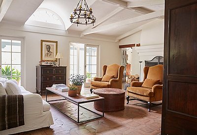
The room’s traditional, clubby feel was designed with the men of the family in mind.
Family-First Design
When devising the home’s overall decor scheme, Bachmann’s main criterion was that it be truly functional for the spirited family of five. “We use every single room,” she says. “The boys are sporty and rambunctious, so there’s nothing in my home that’s so precious that I couldn’t live without it. It’s a happy, lived-in home.”
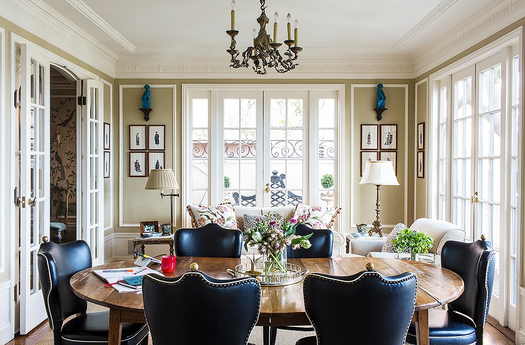
Her carefree attitude is a critical asset. In the cozy room just off the kitchen (the family’s main gathering place and the most masculine area in the house, with its taupe walls and heavy wood table), an eagle-eyed guest might notice that one of the bronze jacket hangers topping the leather-upholstered chairs is askew. “It’s off to the side because it was hit with a lacrosse stick,” sighs Bachmann, who bought the chairs from a gentleman’s club.
The eye-popping paint choice, coupled with the room’s abundance of natural light, allowed Bachmann to use mostly neutral furnishings but still achieve a cheery effect.
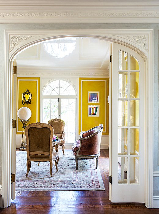
They Call It Mellow Yellow
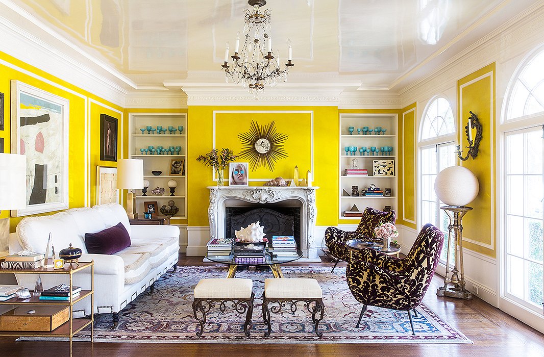
Bachmann’s decision to choose bright yellow for the living room walls was not one she took casually. “I had a lot of fear,” she admits. “I thought it might be really awful!” Inspired by late interiors icon Nancy Lancaster’s famous yellow room at Avery Row, she took the leap. Rather than go with a store-bought yellow, though, Bachmann decided to layer various sunny shades atop a brown base. “I knew if I used just one color, it would look harsh. If you see it in person, it has texture to it—the color is really sort of mellow while still being superbright.”
The bold paint choice is balanced by the relatively sedate palette of the furnishings. “The rest of the room is basically dark plum—and only the two midcentury chairs have a print, so it all integrates,” she says. She made a point of reupholstering the formerly patterned sofa in a simple warm white fabric. “Since the furniture is not much of a statement, I was able to be more colorful with the styling,” she adds, noting the collection of blue glasses displayed on the shelves.
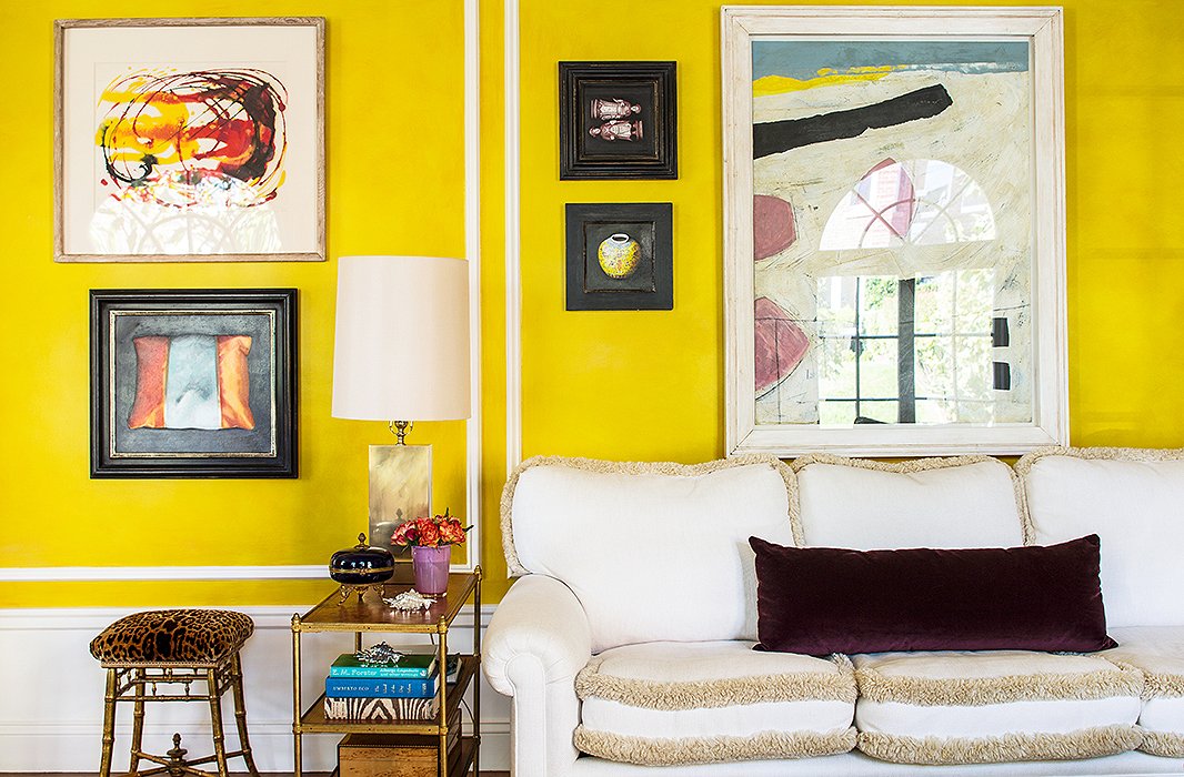
Bachmann’s taste in artwork is all over the map, ensuring that her living spaces are anything but stuffy. Her mix-and-match approach to framing helps heighten the room’s casually eclectic vibe.
The piece in the left corner—which one might reasonably mistake for a lamp—is a twine-covered ball placed atop a jardiniere.
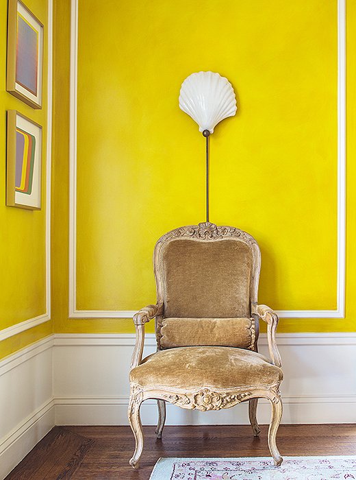
The chair, a French fauteuil in Louis XV style that Bachmann bought in London, is paired with a shell sconce from Past Perfect, a local vintage boutique.
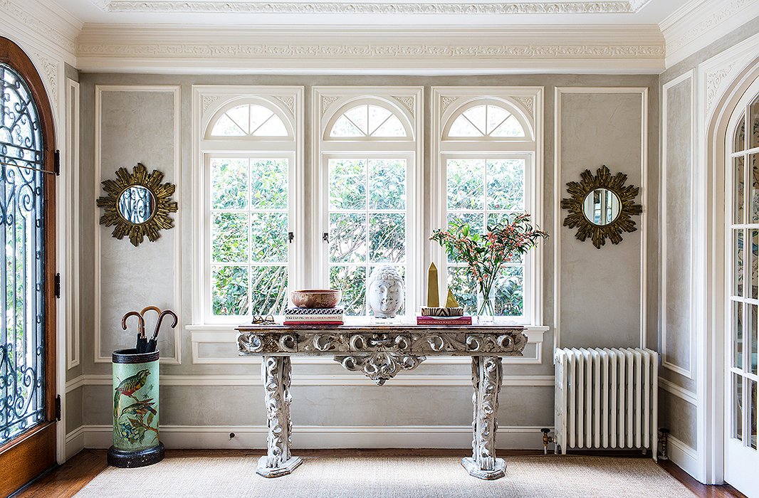
The intricately crafted table, purchased from a London antiques dealer, is among Bachmann’s most prized pieces.
Tradition, with a Twist
“My taste tends to be eclectic,” says Bachmann—an understatement if there ever was one. The foyer is home to one of her most distinctive pieces: a hand-carved Italian rococo entryway table that she bought out from under one of interior design’s boldest boldface names. “Bunny Williams had a hold on it, but I waited and waited until I could snatch it. I felt like it was an even better buy because she wanted it.” In the dining room, a hand-painted de Gournay silk wallpaper lends an air of crisp formality. “I’m not a wallpaper person,” Bachman says, “but I think this print is a work of art. It’s classic and timeless, and it has a great textural feeling.”
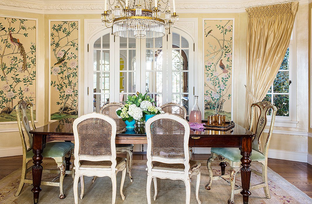
The bespoke wallpaper is the main statement here—all of Bachmann’s other choices (the room’s pale palette, the elegantly timeworn chairs) allow it catch the eye.
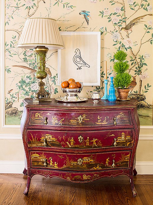
Bachmann’s way with whimsical combinations is evident in her placement of a minimalist Hugo Guinness bird print above an ornate vintage chinoiserie chest.
A Bit of Palm Beach
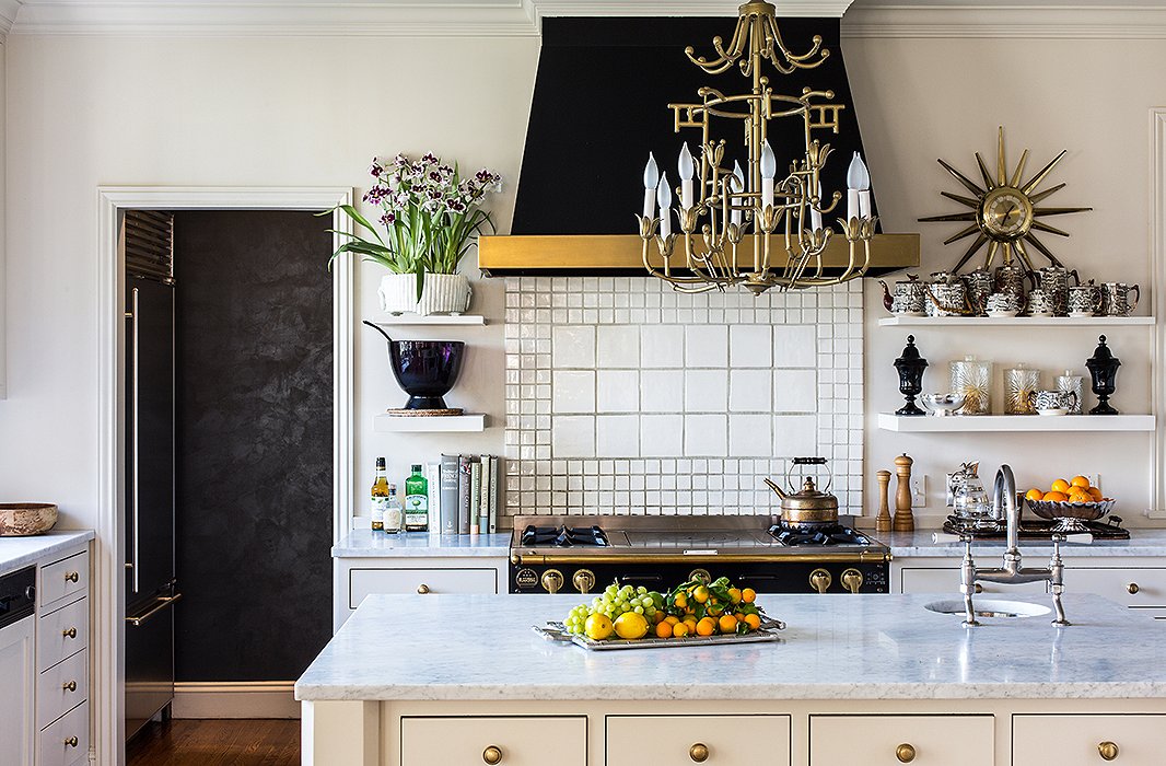
Though Bachmann’s decor is most obviously imbued with a European sensibility, if you look closely, you’ll find traces of her Florida roots. “I grew up in Melbourne, near Vero Beach, and I still love that sort of corny Florida look—the bamboo, the mirrored furniture,” she admits. Case in point? The gilt pieces in her kitchen. “That shiny brass, I love it,” she says referring to the statement-making starburst clock and the can’t-miss chandelier. “Even though I don’t have a midcentury home, that feeling comes through there.”

I’m not a wallpaper person, but I think this print is a work of art.
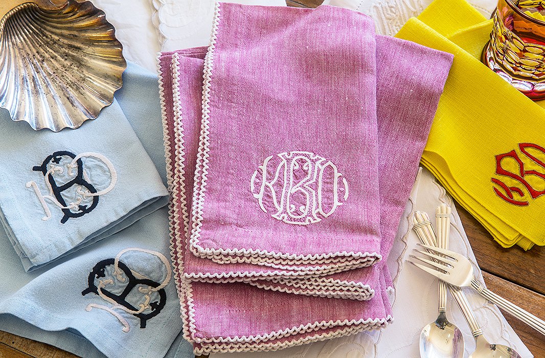
Bachmann has never met a monogram she didn’t love. “I have multiple sets of napkins and monogrammed shades in two bedrooms,” she says. “I think it must be a Southern thing.”
“I cook a lot—not necessarily because I want to,” jokes Bachmann, who’s always entertaining guests, be it casually or formally. Her staple? A lamb Bolognese cribbed from The New York Times.
Perfectly Imperfect
Despite the dents and dings that come with family life, the home’s overall look is admirably pulled-together. You’d be forgiven for thinking the cohesion is evidence of an interior designer’s expert hand, but Bachmann, who decorated the home herself, shudders at the suggestion. While she doesn’t believe in decorating dos and don’ts, she does confess that she didn’t want her home “to look like a decorator did it”—before quickly adding that some of her best friends are decorators. “I just didn’t want the decor to look too contrived,” she clarifies.
Bachmann attributes her affinity for effortless elegance to her time spent in London (she lived there in her mid-20s when her husband, who works in technology, was transferred there). “I was struck by the places of friends that we would visit,” she recalls. “They were so comfortable. The homes could be simple or grand—or anywhere in between—but people really lived in them. They never looked like someone came in and fixed all the pillows and constructed this picture-perfect world.”
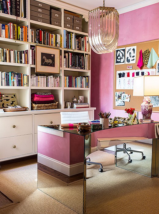
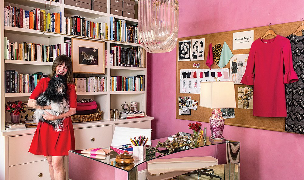
Bachmann’s girly-glam side is given free rein in her home office, where her designs for Kim and Proper take flight.
Signature Style
Most afternoons, Bachmann can be found working on her locally produced designs in her home office, which is vintage and ladylike enough that it’s easy to imagine Audrey Hepburn circa Breakfast at Tiffany’s popping by for a glass of champagne. Pink paint (once again a custom, layered concoction), a mirrored desk (“It’s not superpractical, but I fell in love with it”), and a funky ’70s-era Lucite ceiling lamp create a fanciful vibe. “This is my little space, and I felt like I could do whatever I wanted in here,” says Bachmann. “My office is bright and shiny and colorful and always messy.”
Whether it’s in her home decor or her year-old dress line, Bachmann’s feminine aesthetic shines through. “I like things to be simple but glamorous,” she says. “My house is that, and Kim and Proper is definitely that.” Indeed: Her classic yet modern dresses (all priced at $195) are timeless and wearable. “They’re sexy, but they’re not overt. I don’t want to be wearing the same outfit as my son’s girlfriend!”
Perhaps best of all, the designer has more than enough space to store her own dresses (along with her many pairs of Seafarer jeans—“the original sailor jean that Jane Birkin wore,” she notes) in her custom closet. “I have one side and my husband has the other,” she says, “but I definitely got the bigger side.”
My friends tease me, but l think leopard is almost a neutral. It goes with everything!
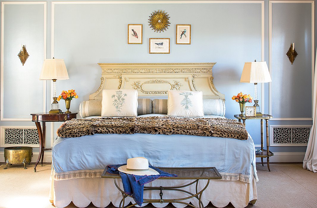
Layered bedding (and a little more leopard, of course) give the room its luxurious feel. “Living with lots of layers makes a space feel like a home rather than a showplace,” says Bachmann.
A leopard-print chair and the lovely watercolor Bachmann lucked upon at a secondhand store add interest to the soothing, sedate space.
Relax and Retreat
At the end of a long day, you’ll likely find Kim Bachmann curled up in her bedroom, with a cup of tea in hand and the fire lit. The room is intentionally more monochromatic than her playful living spaces, allowing her to let go of the stress of the day and settle down. “I love my bedroom because it’s the one place the boys aren’t allowed in,” she says. “I feel perfectly comfortable locking the door and saying, ‘Everybody out!’”
Subtle splashes of pattern—in the form of the lilac window shade and the blue footstool—enliven a purposefully pale palette.
The Casual Collector
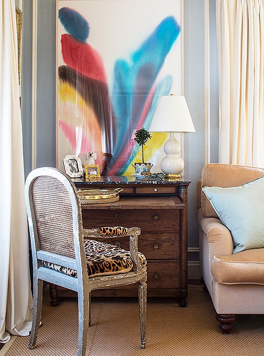
When it comes to acquiring art, Bachmann is motivated by point of view rather than pedigree. Though she studied art history at Christie’s during her time across the pond (and owns works by sculptor Eric Goulder and painter Caio Fonseca), the fine and the fun mingle freely in her home. “We do have some more-serious pieces from our time in London,” she says, “but I mix them with pieces we’ve picked up throughout the years from little secondhand stores and vintage boutiques.”
One of those great scores is the lovely abstract watercolor that rests above the writing desk in her bedroom, bought on a whim from a vintage-clothing boutique. “I literally drove by the shop for a year,” recalls Bachmann. “It was one of those places that is open from like 2 p.m. to 3 p.m. on a Tuesday and 4 p.m. to 5 p.m. on a Thursday. But I finally got in.” When she did, she immediately fell for the piece, despite not having a clue as to the artist or the provenance. “It’s not like we have a great collection, but we have what we love.”
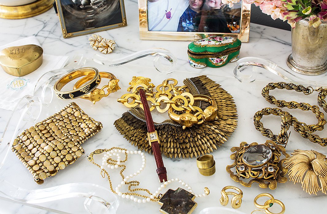
Bachmann favors vintage jewelry. “My style is not supergrand,” she says. She’ll often wear one big piece to amp up a simple outfit—be it one of her own dresses or a pair of jeans and a white button-down shirt.
Just for the Fun of It
The home’s Old World elements are balanced by bursts of whimsy. A curvy chair, set in a hallway against a hot-pink wall, looks like it could have come straight from Alice’s Wonderland. (Actually, it’s was a shabby outdoor seat that Bachmann had reupholstered and painted bronze.) And the designer has never seen a leopard print she didn’t love—note the throw and the chair in her otherwise sedate pale-blue bedroom. “My friends tease me about it,” she says, “But I think leopard is almost a neutral. It goes with everything—I have to stop myself from using it!”
Given the far-ranging mix of design eras represented in her home, you might assume hours of planning and massive mood boards were necessary to achieve the perfect mix. Think again. “I just threw it all in there!” says Bachmann. “I go for it, and then I make adjustments. I don’t like an overly planned feeling, and because I have a specific aesthetic, it all comes together.”
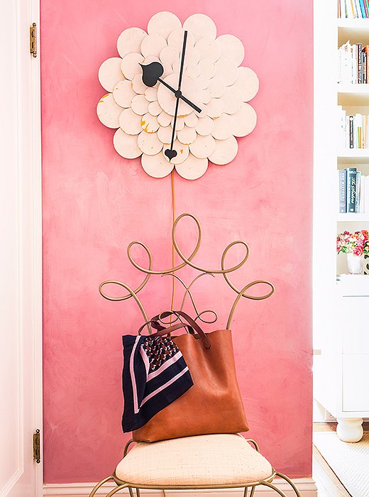
A fairy-tale-like combination is achieved by way of the pink walls and the flower-burst clock—an impulse buy from Bachmann’s London days.
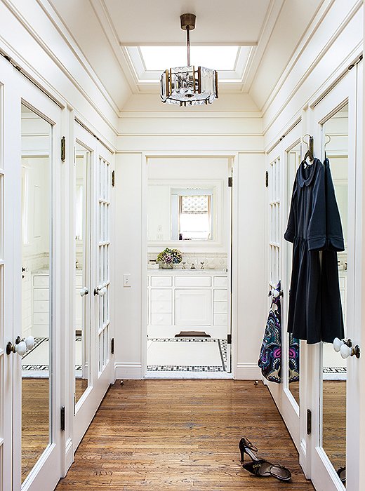
Staying organized is a cinch, courtesy of this to-die-for custom closet.
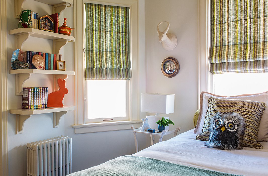
Bachmann designed her youngest son’s room when he was 8. It’s still sweet, but not so much so that the now 11-year-old can’t hang out there with his friends.
I don’t like an overly planned feeling, and because I have a specific aesthetic, it all comes together.
Taking the Long View
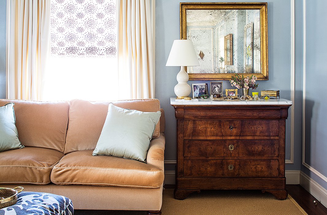
Perhaps one reason Bachmann’s home is so inviting is that it wasn’t put together in a hurry. Even before she moved in nearly two decades ago, Bachmann had accumulated enough pieces to give the place a supremely stylish start. While living in London, she frequented Kings Road and Wandsworth Bridge Road, picking up pieces as inspiration struck. Those came back to the States with her when her husband transferred to San Francisco, as did her finds from across the English Channel. The chandeliers in the living room, for instance, are rock crystal and gilt tole circa 1780 from the estate of the late Italian collector Giuseppe Rossi; Bachmann bought them in Paris. “I also often went to the Marché aux Puces,” she remembers. “It’s still possible to get good pieces at good prices there.”
Bachmann’s canvas is ever-evolving: “There are always new things coming in and out of the house.” And even if if she didn’t buy another settee for the rest of her life, Bachmann would be set. “I have three containers in South San Francisco full of stuff. I find it very hard to part with things; I always think I’ll need it for another house.” Her oldest son, who is set to graduate from college this year and plans to move to the East Coast, is about to become the biggest beneficiary of her smartly curated stockpile. “In my mind, he’ll have the best apartment ever,” she says.
I am a huge fan of saturated color but I’d last less than a minute in that yellow living room. It’s garish.
Gorgeous!!!
Yellow walls are too bright. Should be softer shade of yellow. Too much cluttered decor. On the whole, this place lacks cohesiveness and tranquility. The owner is just trying to hard to impress.