Designer Michelle Nussbaumer travels the globe in search of inspiration—and the one-of-a-kind finds she stocks in her Dallas shop, Ceylon et Cie. Along the way, Michelle indulges in one of her biggest passions: patterned textiles. “Ikat is a favorite, suzanis, Kashmiri crewelwork, damask, toile… I don’t think I’ve ever met a textile I didn’t like!” says the designer, whose own fabric line incorporates far-flung motifs from Africa, Central Asia, and beyond.
Her first book, Wanderlust: Interiors That Bring the World Home, showcases rooms brimming with her beloved fabrics, including client projects alongside Michelle’s own homes in Dallas and Gstaad, Switzerland. It’s an undeniably lush, layered, and complex aesthetic—one that takes a seriously trained eye to pull off. To help decode the often-daunting world of print mixing, we tapped the designer for a few lessons in decorating with patterns. A preview: More is more, color cures all, and when in doubt, a little drama can be just what a room needs.
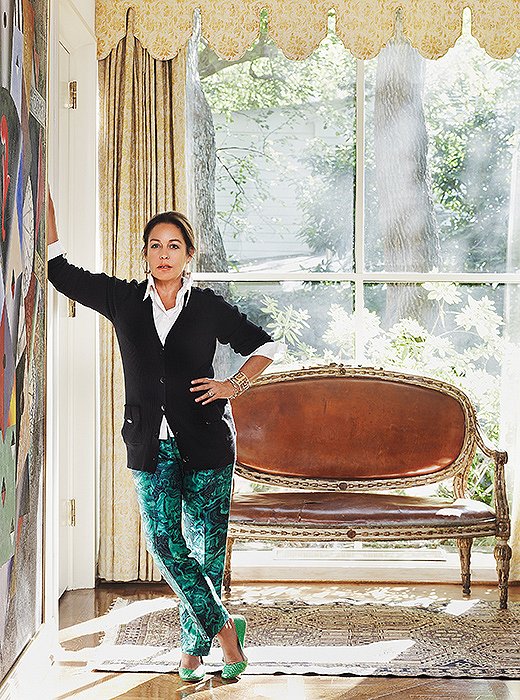
Designer Michelle Nussbaumer at home in Dallas, where she and her Swiss-born husband have lived for nearly two decades.
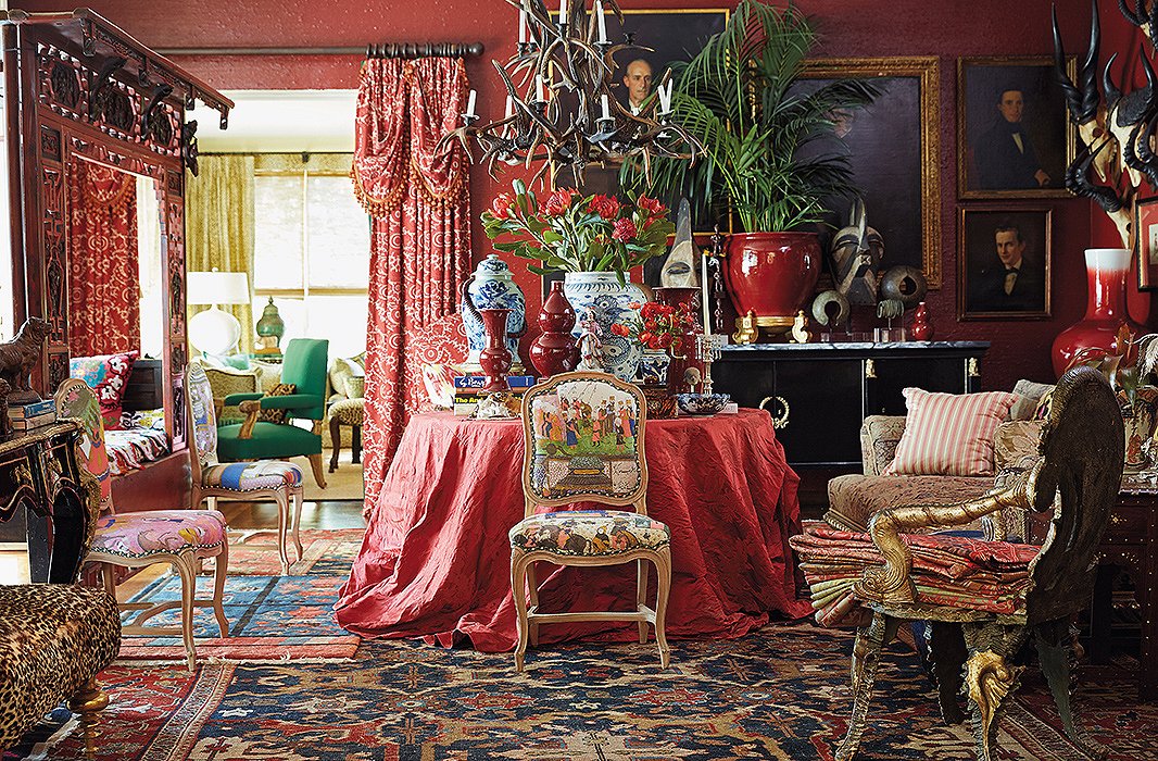
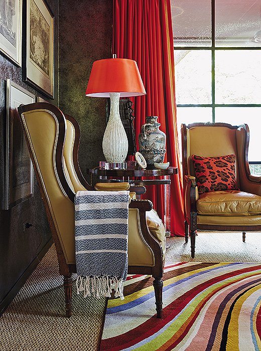
Michelle’s favorite shade is a rich vermilion—and in her Dallas library, she’s let the color flow from the walls to the furnishings to the floor. Amid the wash of color, a mix of worldly patterns feels unified.
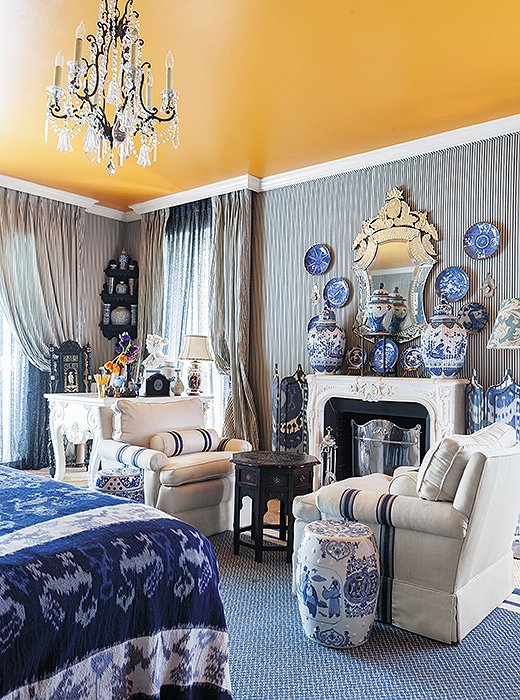
In Michelle’s Dallas master bedroom, a blue-and-white palette unifies all manner of prints and patterns, from classic ticking stripes to large-scale ikats.
Lesson 1:
Bring It Together with Color
Michelle is an unabashed color fanatic, and it’s often where she starts with clients when beginning a project. “I do a whole questionnaire and really try to understand what they love and what colors they respond to,” she says.
But when it comes to mixing prints, she recommends paring back your palette. “I get so much joy from mixing unconventional patterns that might not seem to go together but that in the end create an overall harmony that is rich and many layered,” she writes in Wanderlust. “The way to do that is by keeping the colors similar—whether with my beloved blues or with the exuberant colors that bring me so much joy or even with the paler shades that speak of subtlety and nuance.”
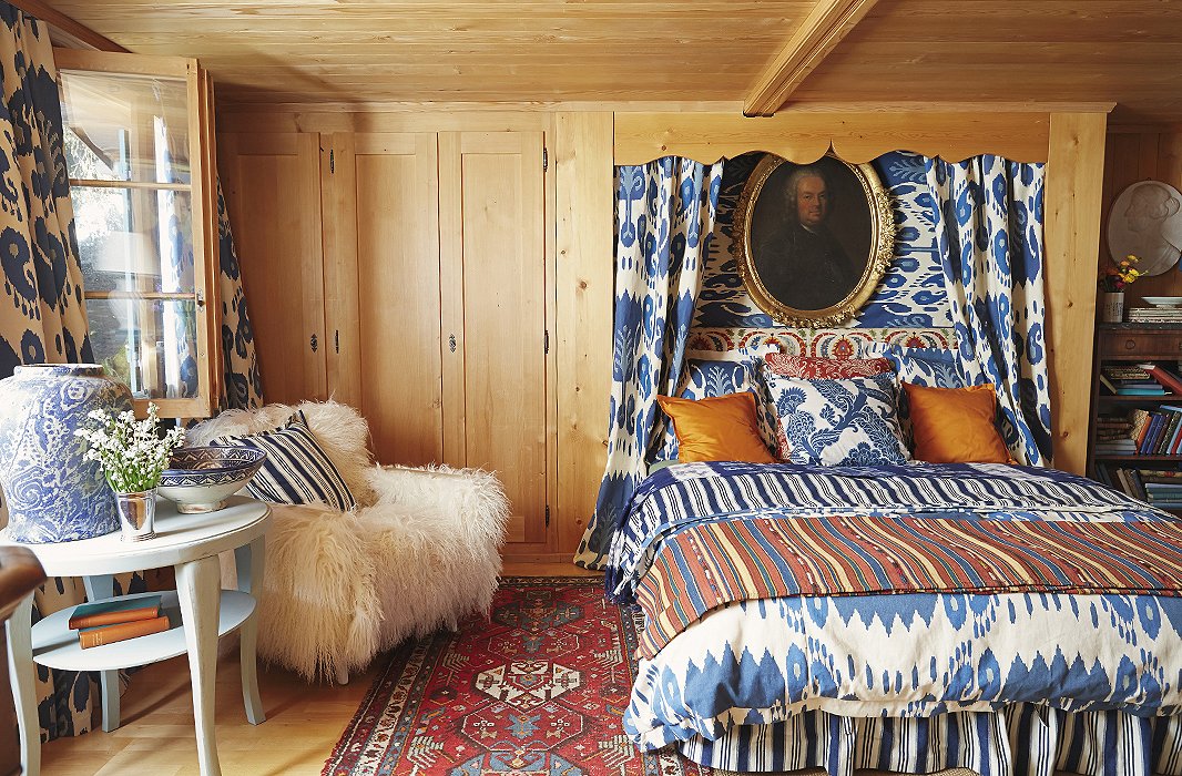
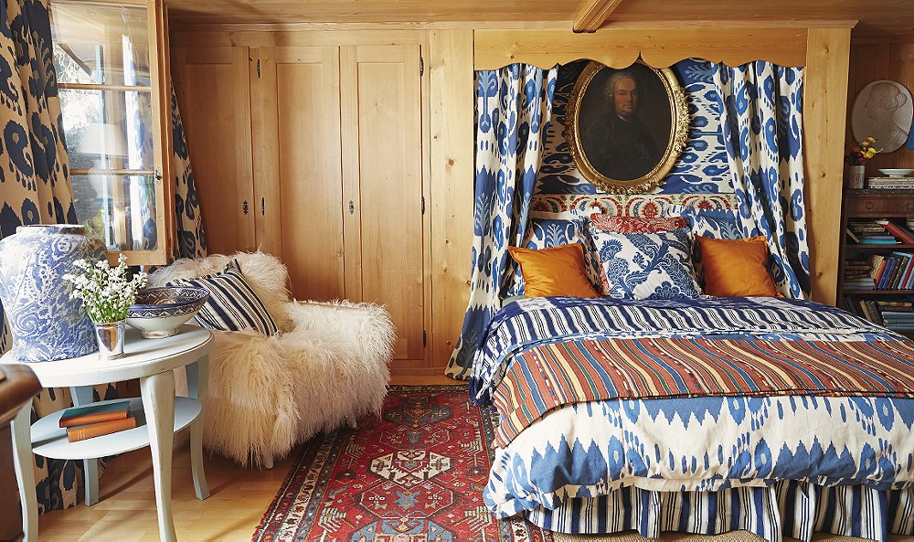
Stripes, ikats, and florals—all in a bold mix of blue and orange—coexist happily in the Gstaad bedroom of one of Michelle’s sons. Solid orange throw pillows and a plush sheepskin chair give the eye a moment to rest.
Lesson 2:
Go for Variety
Combining patterns of various types results in a more compelling mix—and keeps a layered look feeling balanced instead of overwhelming. “Think of diversity,” Michelle says. “Try mixing an embroidery and a stripe, or a floral and a paisley.” And don’t forget to inject a little breathing room. “You do need some solids in there to break it up.”
“Whether on a grand scale or a miniature one, the play of pattern on pattern enhances rooms—and lives—in an endless variety of ways,” writes Michelle in Wanderlust.
Lesson 3:
Choose Complementary Pieces
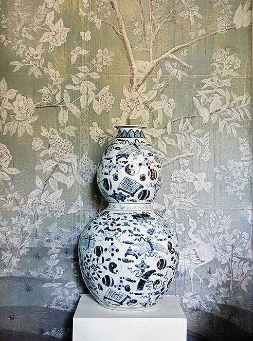
One foolproof way to ensure a mix of patterns feels harmonious? Look for motifs with a common history. The pairing can be authentic, as in the case of two vintage finds, or a newer mix that simply draws on antique inspiration. As Michelle writes, “When items share a cultural lineage, related visual motifs, and complementary palettes—such as an 18th-century blue-and-white Chinese gourd vase standing proudly in front of 18th-century Chinese painted wallpaper—an arranged marriage feels like a match made in heaven.”

Think of diversity. Try mixing an embroidery and a stripe, or a floral and a paisley. And you do need some solids in there to break it up.
The TV room of Michelle’s Dallas home is both cozy and calming in rich caramel and red tones. Touches of pattern in the pillow, the throw, and the rug are just enough to enliven the space’s solid tones.
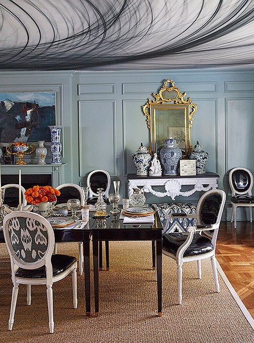
In her Dallas dining room, Michelle upholstered just the backs of her dining chairs in a striking ikat fabric. On the ceiling, patterned wallpaper (actually a detail of a photograph blown up to room size) adds an unexpected moment of drama.
Lesson 4:
Start Small
For the pattern-shy, just a touch of print—a vibrant throw pillow on a solid sofa, a patterned headboard in a neutral bedroom—can go a long way toward refreshing a space. Michelle suggests starting with one standout piece of fabric, such as a vintage suzani, which can be simply draped over a table or a desk for a low-commitment touch of pattern anywhere.
Lesson 5:
Add an Element of Surprise
Michelle is a master at using patterns in unexpected ways. Case in point? She’s not afraid to wallpaper a ceiling. “I like to think of every room as having five walls,” she says. “I think people very often forget about the ceiling—it’s an opportunity to add another element.” On a smaller scale, a hint of bold print on the back of a chair can be just the zing needed to enliven a room.
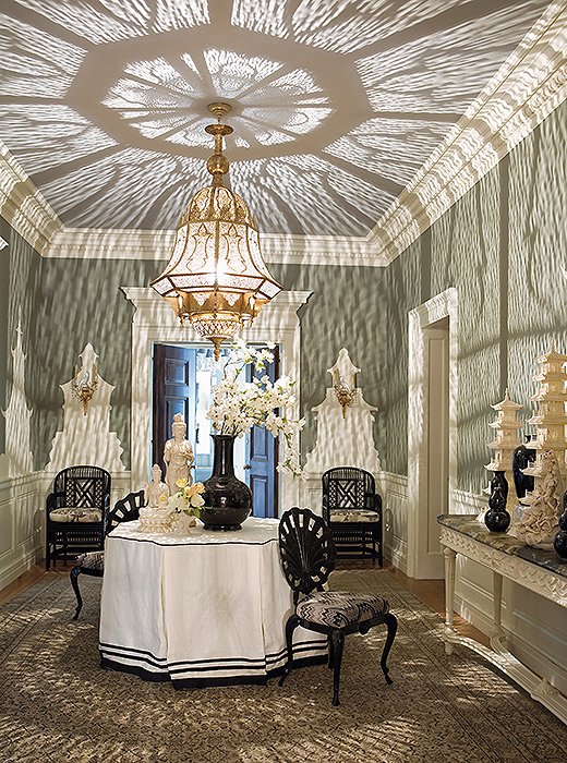
Michelle modeled this grand chandelier after a Turkish lantern. She writes in Wanderlust, “At the flick of a switch, light and shadow spill across the ceiling and over the walls in a fantastic filigree that transports you to the era of Scheherazade.”
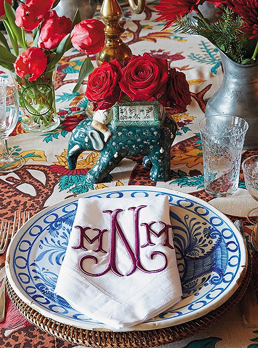
At her family’s home in Switzerland, Michelle sets a pattern-happy table with blue-and-white Spanish plates, monogrammed napkins, and a bold floral tablecloth.
Lesson 6: Think Beyond Textiles
“Sometimes I will use the lighting to create pattern,” Michelle writes. “I may select furniture for the same purpose, because the carving on the legs, back, and arms or the silhouette itself can establish pattern or contribute to the language of pattern that is already in place.” Even on the table—in a set of patterned plates or intricately adorned silverware, for instance—pattern has a role to play, she adds. “There are so many different ways to incorporate some pattern into your life, and I like to try to help people find that.”
I like to think of every room as having five walls. I think people very often forget about the ceiling—it’s an opportunity to add another element.
Join the Discussion