Mixing multiple patterns in a room can be intimidating: Will this plaid clash with that zebra stripe? Are two floral prints one too many? Yet layering patterns gives a room a unique depth and richness. What’s more, your choice of patterns and the way you use them make a space uniquely you. A room that features a cheetah-print sofa complemented by floral pillows and damask curtains makes a very different statement from a room with the same sofa paired with kente-cloth pillows and palm-frond wallpaper.
Fortunately achieving your ideal medley of patterns is fairly simple. Below, a few tips that will have you mixing prints like a pro.
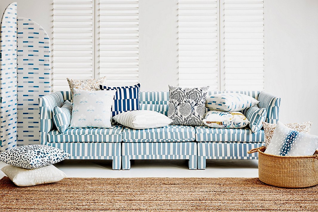
Blues and whites add cohesiveness to this mélange of patterns. Complementing the Sidney Room Screen in Nigel Chambray and the Bryn Sofa in Jump Stripe Chambray, both of which are One Kings Lane exclusives, are a variety of exclusive pillows.
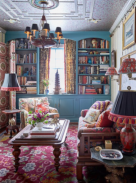
There are at least a dozen patterns in this room, but the varied scale and the cohesive palette keep things harmonious. Room by Madcap Cottage. Photo by Tony Vu.
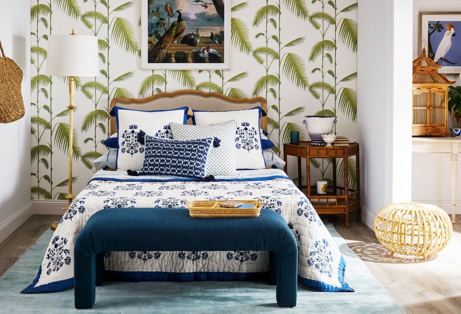
• Use one or two colors to tie your patterns together. Stripes, dots, ikats, and florals that all include, say, moss green will maintain a certain cohesiveness. That common color doesn’t have to be the most prominent in each print, however. Maybe the moss green is the primary color of a bedroom’s striped headboard and dotted quilt but more of an accent in the floral curtains and ikat chair.
• Vary the scale of your prints. Oversize geometrics and oversize florals and oversize dots can, well, overwhelm. Oddly enough, so can tiny florals alongside skinny stripes and itty-bitty dots. When you vary the scale of your prints, the tighter patterns read almost as a neutral in comparison with the bolder ones. This enables you to use a larger-scale pattern to draw attention to a particular piece.
• Feel free to go big with prints in small spaces. In fact, some designers suggest that the pattern-wary start by introducing prints into petite rooms. Patterns, particularly larger ones, can make a small powder room, reading nook, or guest room feel more spacious—or at least distract from its minimal proportions. (And if you end up hating how it looks, it’s easier to redo a small room than a large one.)
• If you love it, go for it. Forget what anyone else says: So long as you enjoy your mix of colors and patterns, you got it right!
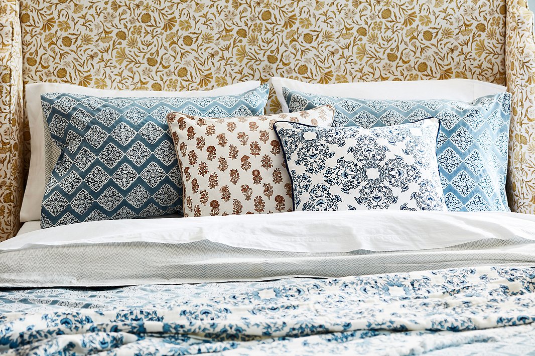
A tight palette and a common inspiration—Indian block prints—make this bedroom vignette serene rather than distracting. The Aurora Headboard in Vine Botanical Ochre is exclusive to One Kings Lane.
Join the Discussion